Client: DIRECTV
Agency: Work & Co
Role: Designer
Year: 2022
Directv
-
The Ask
A full site redesign.
-
The Problem
Overwhelming content.
-
The solution
Content mapping designed into components.
Overview
Post launch we saw a 20% improvement in progression to shop and 5% lift in online sales.
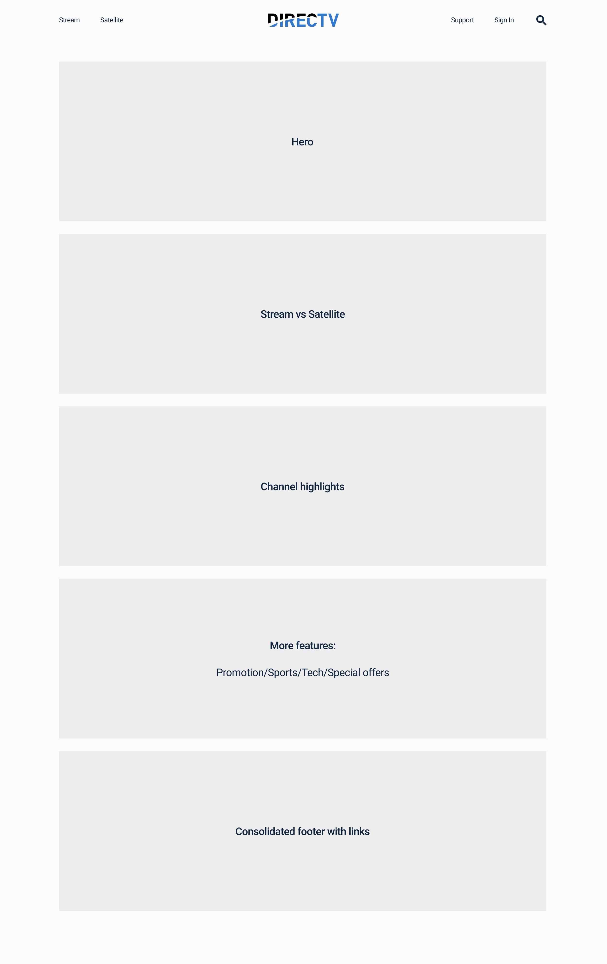
For the redesign we developed a cohesive site map while elevating the digital brand identity to clearly communicate DIRECTV’s two product offerings. Establishing a clear distinction between Satellite and Stream.
In the previous site each page was treated as a sales driver with repetitive copy, taking the user on a looped journey of unanswered questions.
With a mobile first approach we identified the information architecture and designed a set of content cards that support DIRECTV’s offerings and can easily be stacked into clear landing pages.
Design Principles
o1
Put messaging and content first to serve the consumer.
o2
Use accessible colors, font sizes, and styles.
Be modular to support content management, development, and design consistency.
o3
Direct
Simplify
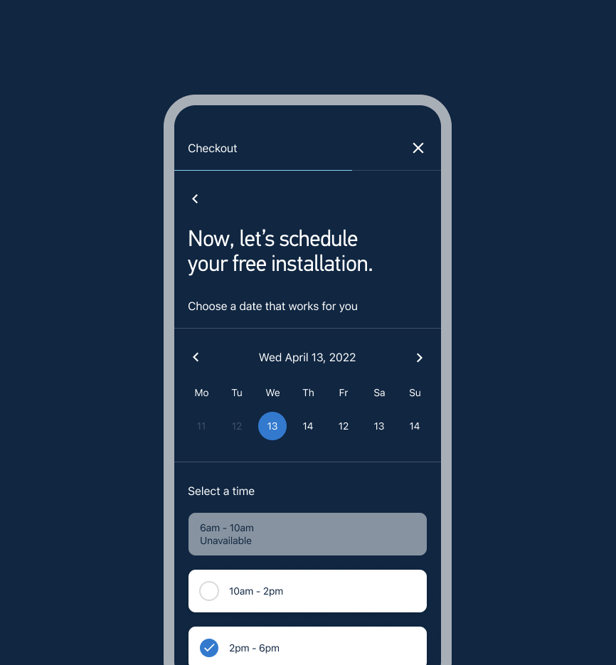
Our goal was to simplify the flow and increase clarity across the site. We did this by removing excess and redundancy, clearing key user pathways and editing messaging. This helps guide users to find what they want, more quickly. Informed, confident users become more decisive.
Search
During user research we found users were confused on what plans included certain channels. This delayed their ability to make a decision and initiate the buy flow. We optimized our search experience to specify plan details under channel labels to better guide users to the plan that would fit their interests best.
Content Cards
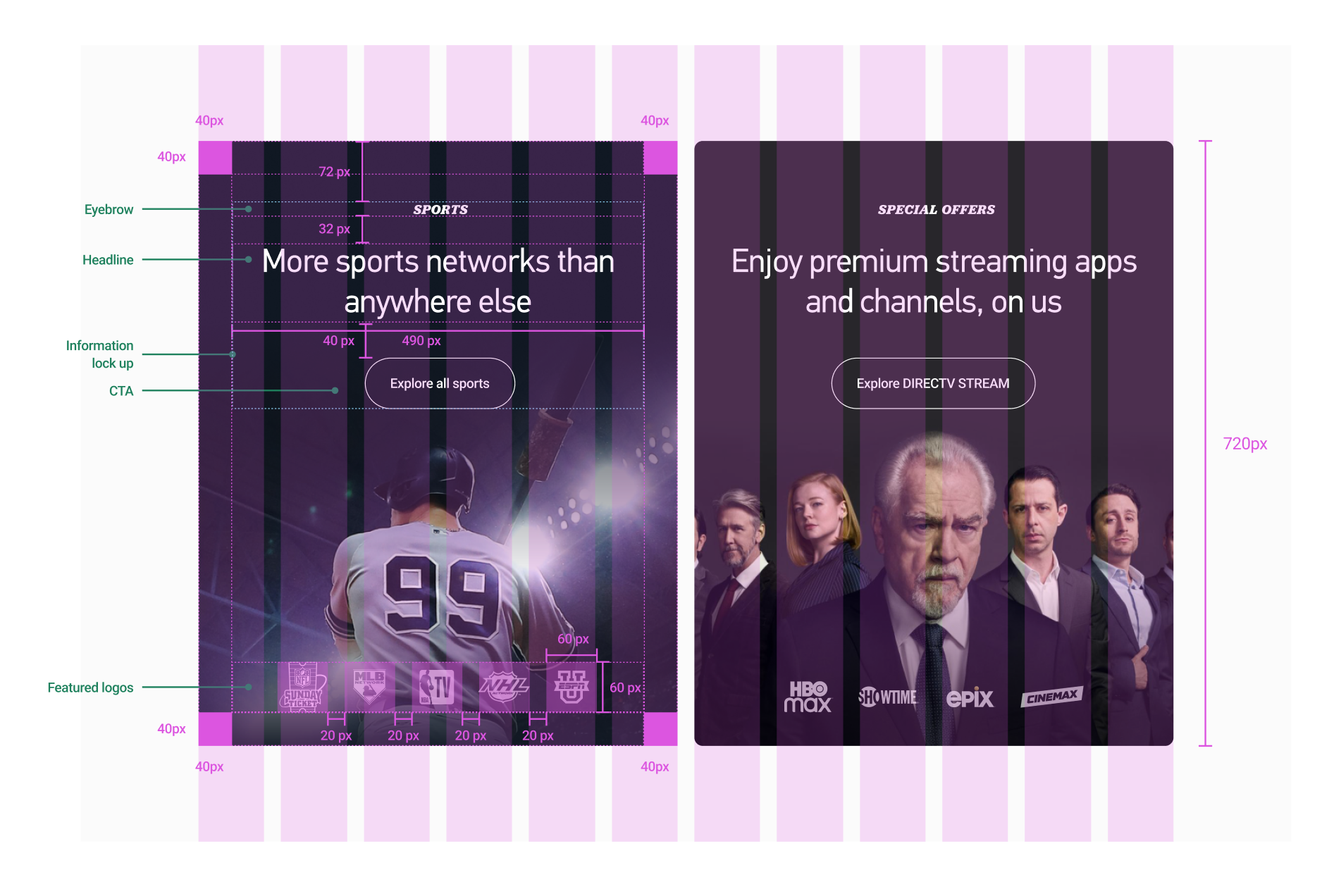
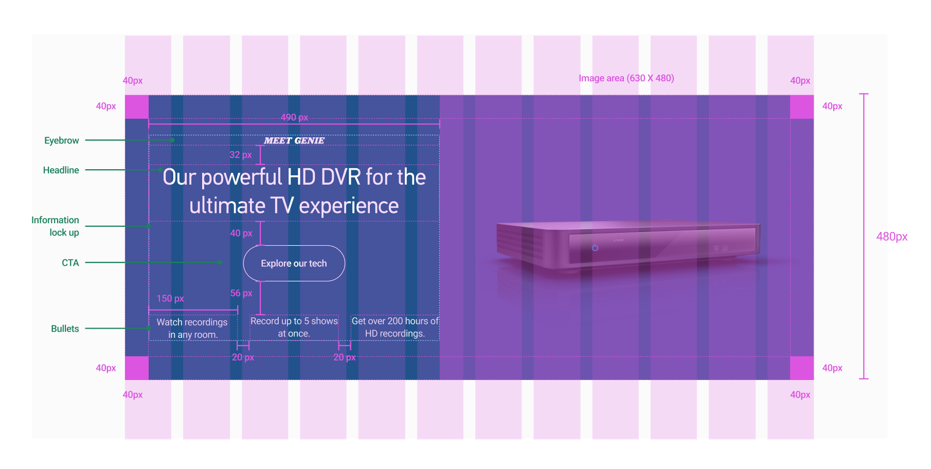
We created a card system of components designed as 1 full-width card or two side-by-side cards that could seamlessly build landing pages and intake various forms of content.


